Cascade UI/UX and accessibility transformation
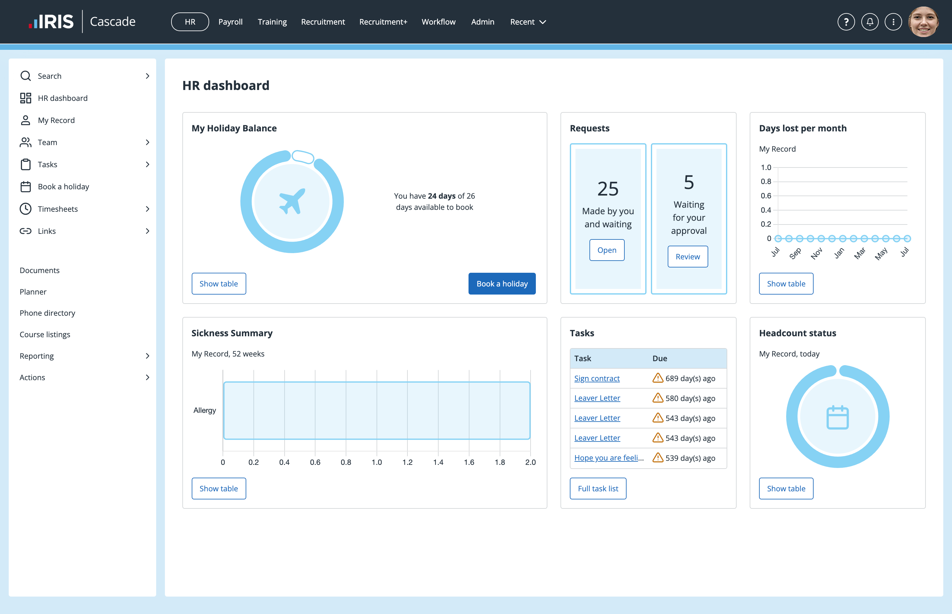
The primary objective was to transform Cascade’s UI to present it as a modern, professional enterprise platform, as part of the IRIS software portfolio. As it was, Cascade had a fantastic feature-set, but looked dated and had poor accessibility.
The solution, implemented in stages, included:
- New style guide, complimenting the IRIS brand and UI guide
- Responsive page structure
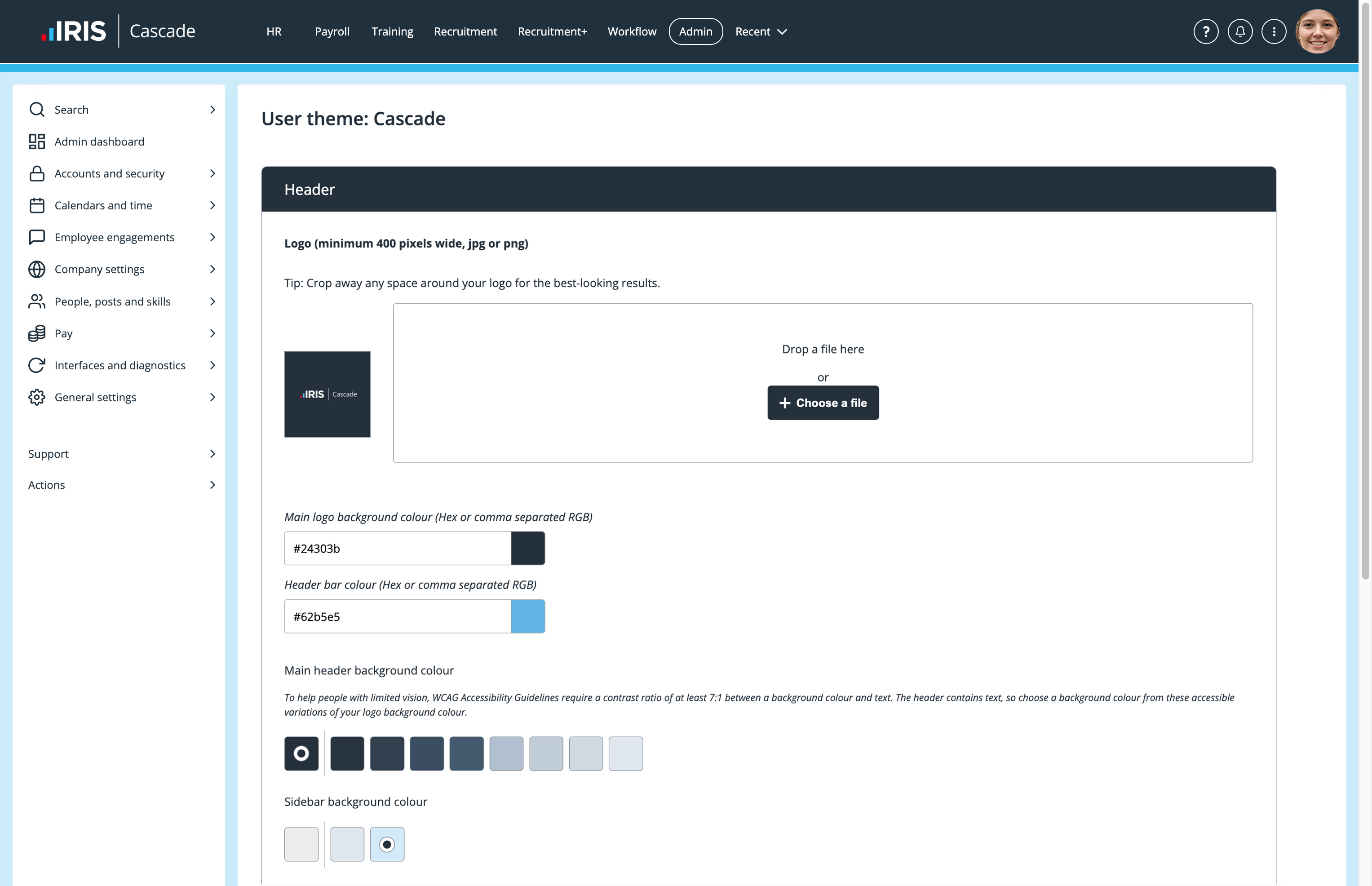
- New customer branding options
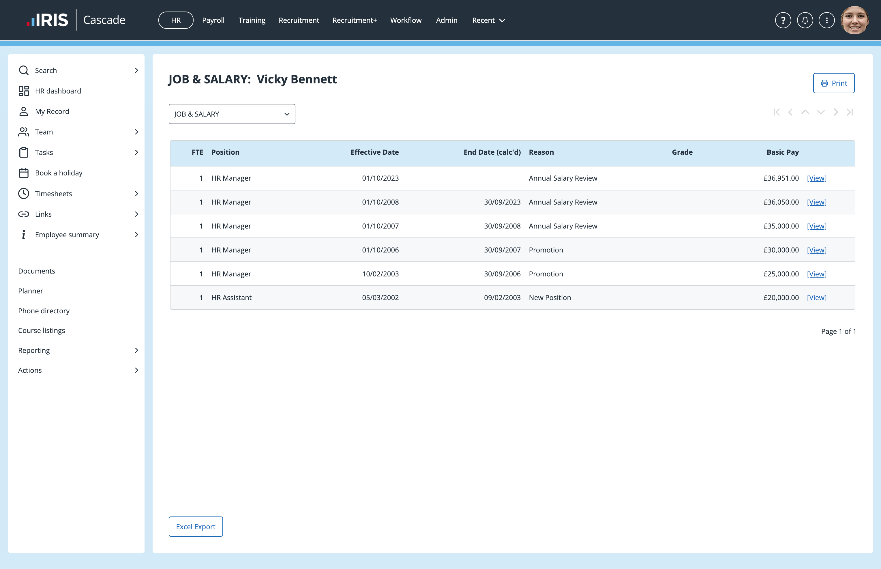
- New primary navigation
- New secondary sidebar navigation
- Improved dashboard charts
- HTML upgrades
- Accessibility enhancements.
The project was broken-down into numerous phases, each with its own challenges and additional requirements. Working closely with product, sales and engineering teams, we devised solutions, tested changes and managed the roll out. Cascade continues to perform strongly.
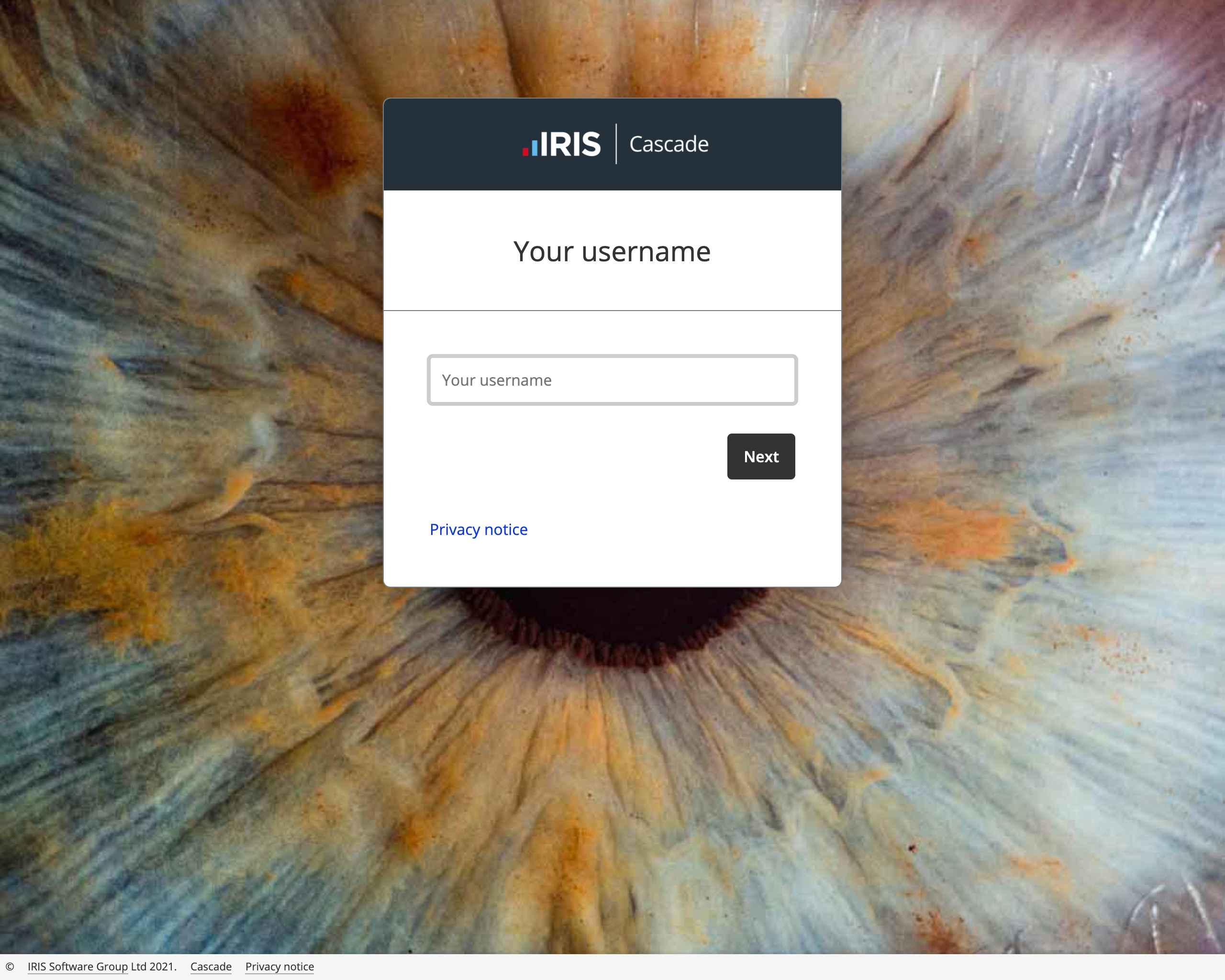
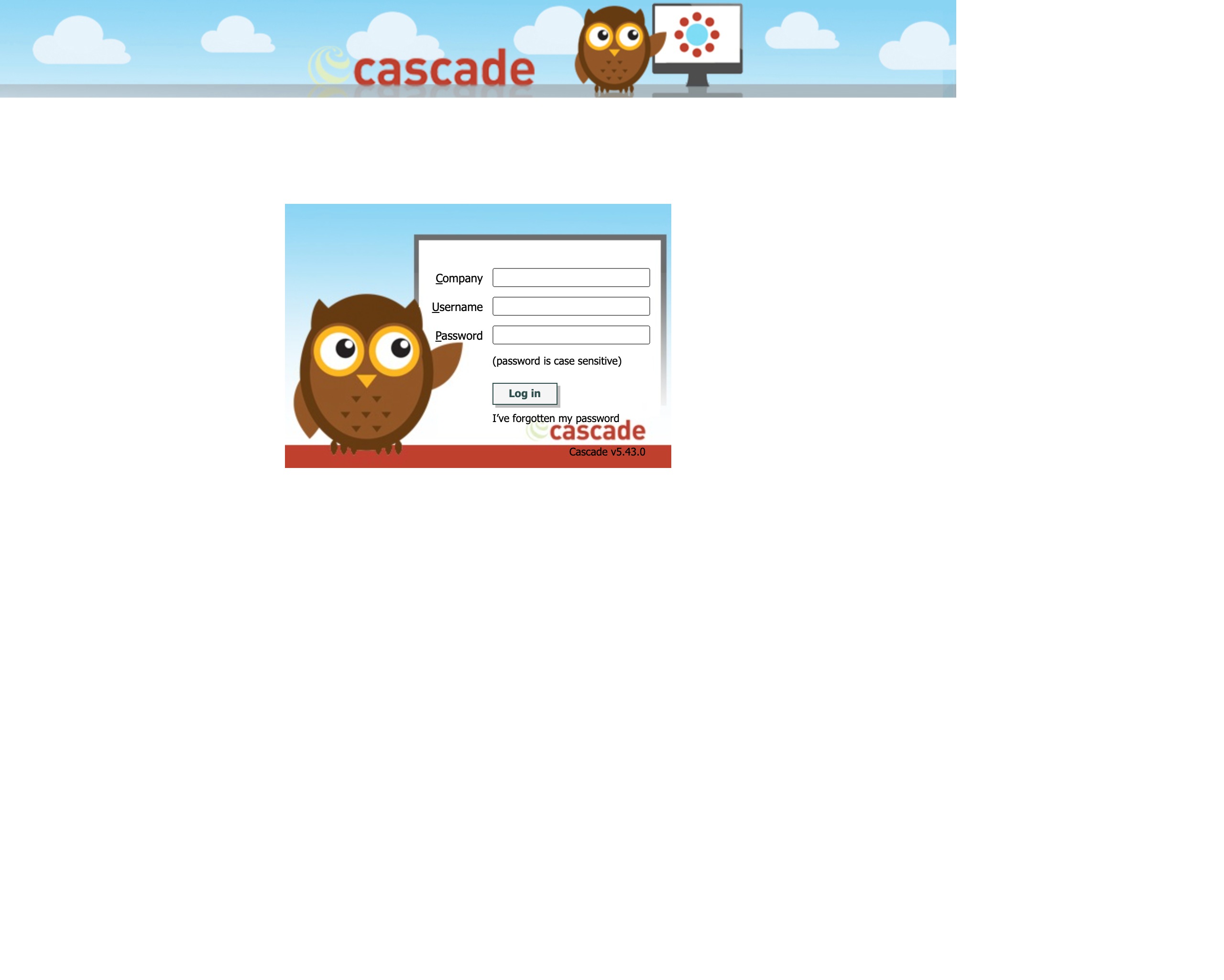
1) Aesthetics and IRIS styling
Since the original UI was introduced, user expectations and the competitive landscape had changed considerably. The app was starting to look old fashioned and we were listening to customer feedback.
Cascade is also now part of the IRIS family of business software, with strong new branding to suit. We needed synergy between the brand and the product’s look and feel – it’s an important part of the overall customer experience.
In collaboration with the wider User Experience and Product teams, I created a new style guide, based on the IRIS brand guidelines, which specifies the styling, behaviour and accessibility requirements of all the key user interface elements. Treated as a project in its own right, it gave us a solid starting point for this transformation.
2) Accessibility
Improving accessibility wherever possible should be part of any project. We started with improvements to font sizes, use of colour, spacing and responsiveness throughout the app. This laid the foundations for further enhancements to landmarks, headings, navigation, tab order and much more. For the first time, most of Cascade could now be used by a large proportion of assistive technology users.
3) Full screen and responsive
The main structure of the existing UI was created at a time when it was almost exclusively used on predictably-sized displays. Of course, times have changed, and we use wildly different screen sizes nowadays.
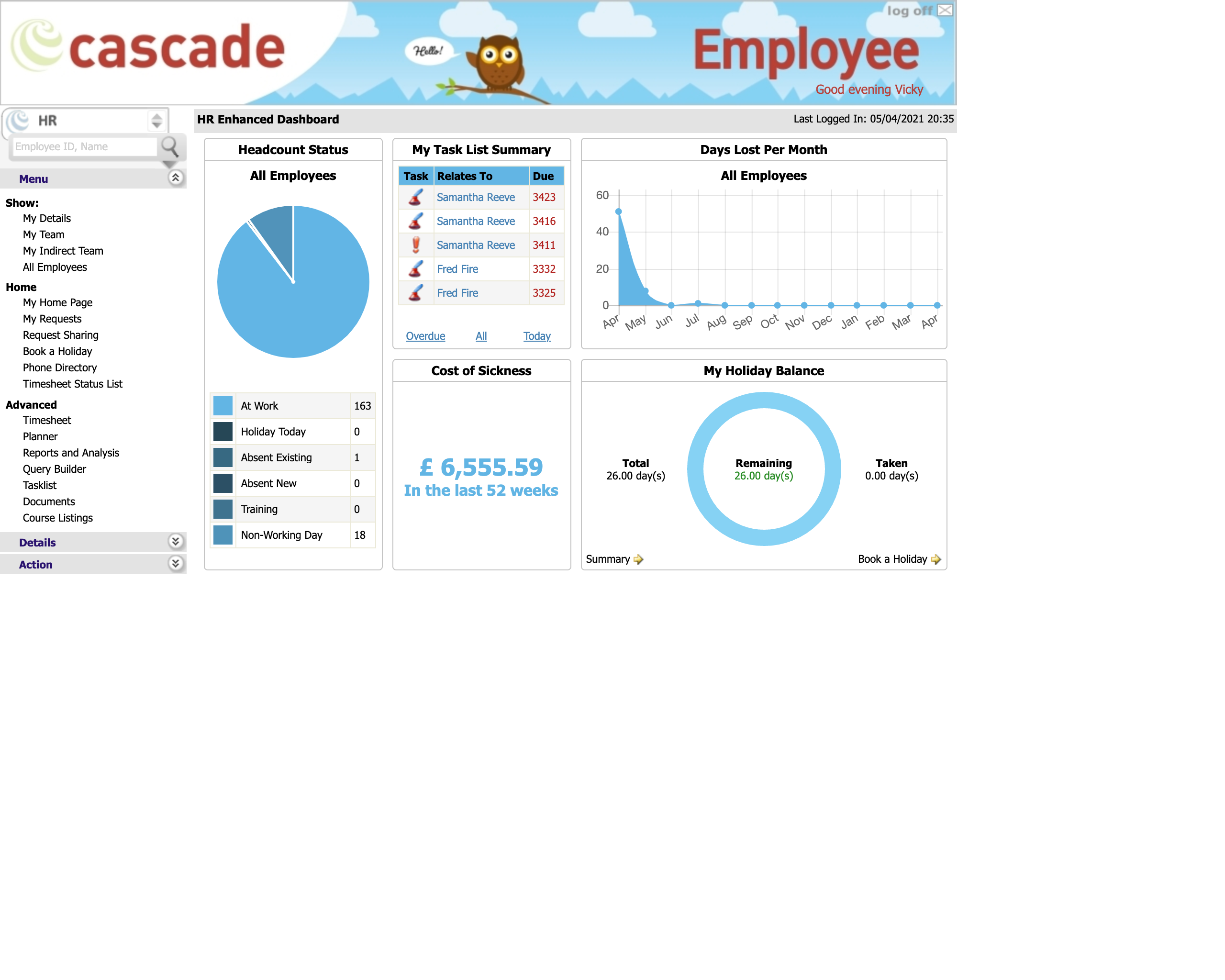
Rather than being fixed dimensions and positions (see the screenshots below), customers wanted us to loosen Cascade’s shoulders. So we allowed it to use more of the screen when space is available.
This alone posed tricky technical and design challenges, but we found creative solutions and the results are well worth the effort.
4) Customer branding
Cascade is usually rebadged by customers to fit their own branding. The tools for doing that weren’t the easiest to use and discouraged customers from making updates when their brand changed.
So new branding options were designed and built. They were focussed on easy of use, and the careful display of a customer’s logo and colours in a way that didn’t interfer with the accessibility of the app – regardless of what colours the customer chose.
5) Efficient approach
Cascade is a large product, with thousands of screens and states to consider. Regardless of how important a restyle was, doing the whole app seemed too big a task.
Undeterred, I worked with the product and engineering teams and led an exploration of our options. We kept an open mind and found solutions that often needed only small amounts of developer time, minimised change risk, and could encompass every corner of the app.
Cascade is a fantastic, feature-rich product and the work to keep improving it continues at pace, with many more UX, UI and accessibility enhancements in progress and in the roadmap.