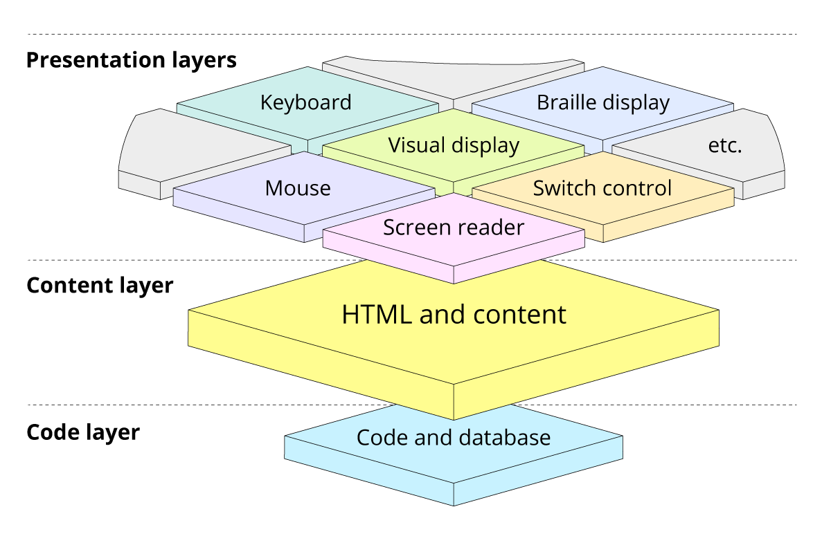
Separating the content layer from the presentation layers
Content and presentation are two very different things, but are often designed and built as though they were the same. More often than not this results in a single presentation – to a visual display, with keyboard and mouse interactions.
Imagining content and presentation as separate layers helps us make a conceptual separation. It gives us the ability and freedom to create multiple possible presentations. And ultimately, a higher quality, more accessible user experience.
One content, multiple presentations
The content layer
The content layer is written in HTML (Hypertext Markup Language). It’s where the meaningful content calls home. It’s where the document is organised into a logical order with headings, quotes and all manner of other content types clearly defined. It’s where we put hyperlink destinations, alt text and aria values.
The presentation layers
The presentation layers are what the end users get. Which presentation each of them receives depends on their individual combination of technologies. Perhaps they have usable vision and see the content on a display screen. Maybe they prefer a braille display, or a screen reader. It may be they use a mouse. But for all we know, they may instead rely on their keyboard, switch control or voice to interact with the content.
Designing for different layers
As designers, many of us learned our trade based around aesthetics and user interaction with a visual interface. It doesn’t always come naturally to think about non-visual interactions with the same interface.
Similarly, thinking about tab order and other keyboard interaction when we’re focussed on creating a pleasing visual balance between different elements isn’t something top of our minds.
And then, having created something that looks good and ticks a lot of boxes, we can be quick to move on to the next screen or project.
We forget, don’t know about, or don’t care enough about the content layer.
Content structure
By thinking about content and presentation as two distinctly different things, we give ourselves a much better chance of understanding – and designing – the structure of the content. Because we aren’t distracted by how it’s presented.
There is an obvious overlap here between content design and user experience (UX) design. And that is absolutely fine.
Content designers should know a bit about how content affects user experience. Visual, or UX designers should know a bit about how to write and structure good content. And, if those are distinct roles in your team, overlap just means closer collaboration and a higher quality product.
Presentation and interaction
After focussing on a great content structure with all the detail mapped, we’re then free to think about myriad presentations.
Helpfully, by getting the content right – by thinking about it properly – we’ve already got ourselves a long way towards a great presentation experience for lots of assistive technology users.
That’s because we’ve considered the content types and HTML semantics. We’ve added alt texts and given everything proper captions and labels. The document is structured in a logical order. Screen reader, braille display, keyboard, switch control and voice control users are already in a much better place.
So we can now head off and create beautifully aesthetic layouts knowing which order everything should be in. We’re more likely to be thinking about those keyboard users tabbing though and needing decent focus appearance. We’ll be better able to imagine (and test) the screen reader experience. Our designs – aesthetic and experience – are considerably better for it.
Developing for two layers
As developers, we can often feel a step or two away from end users. We’re usually focussed on making things work, passing data between databases and getting dynamic content to the screen.
We’re not designers or product owners. We may or may not have an eye for what looks good, or know what makes a great user experience. What we do know, is our domain is the technology. And that’s where we excel.
But, like there is overlap between the roles of content designer and user experience designer, there’s overlap between engineering, design and the end user. And that overlap is HTML.
The content layer is the HTML layer
Forget about colours and absolute positioning for a moment. Instead, think of the HTML as the bit every end user actually gets, regardless of the presentation. It’s how the content in the content layer is marked up.
UX and content designers definitely need to know enough HTML to be able to structure the content and design the interactions. But, as developers, we need to know how to write perfect HTML so we can build it.
Designers, product owners and end users are all looking at us to get the ‘code’ spot on. Putting aside the ‘HTML is markup, not code’ debate for a moment, consider this: as an engineer, only you have the power to write it and commit it to the project. Learn how to write great HTML. It’s very easy.
Know the semantic difference between a button and an anchor. Learn about proper heading structure and page regions. Know when elements need accessible labels or captions so you can ask for them if not specified. And be comfortable testing with a keyboard and screen reader – perhaps even before you’ve written a single line of CSS.
As a bonus, now you have the content layer – the HTML – properly marked up, you should find the desired presentations much easier to achieve and more maintainable – for all visual as assistive technologies. Because your markup, and the content it contains, is tidy, lean and properly structured.
Handing over, testing and working together
Whatever your role in the process – product owner, UX designer, researcher, content designer, developer, quality engineer (QA) – it’s critical to continually think about your end users.
The content layer is where most of the overlap happens between each of the disciplines, and between us and the end users.
- Structure the content in a meaningful order.
- Specify content types in the designs (quote, button, link, paragraph, level-2 heading, etc).
- Include captions, aria labels, alt text in the content.
- Specify audible presentations in the UX design (i.e. ‘when focussed, screen reader should announce…’).
- Designers, test with people with range of accessibility needs and different presentation technologies.
- Engineers and QAs, test with a the keyboard and other assistive technology presentations.
- Product Owners, make sure acceptance criteria – for your designers, writers and engineers – cover multiple presentations.
Summary
Content and presentation are two separate things. When we get the content layer right – by working together to create something that is beautifully structured and marked-up – we’re free to create as many presentation layers as we can possibly imagine.
And we’ll have a higher-quality, more accessible and more desirable product at the end.