Florence Light UI, UX, product and brand design
Designing a ridiculously easy healthcare app from scratch
Florence Light is an interactive text message service for the health sector that gives patients the ability to submit health readings such as heart rate, blood pressure and weight and get feedback or instructions based on their reading and their particular condition. It’s administered by clinicians – usually their GP.
Top level objective
Create a Florence Light web app front end for clinicians that is easy to use, quick to administer and friction free.
It‘s is an alternative to the established award-winning Florence patient messaging service made by the same team. Where Florence is contract-based, requires training and is fully customisable, Florence Light‘s aim is to be much easier to use with pay-as-you go pricing, self service plans and zero training required.
Requirements
- Make Florence Light really quick and easy to use – clinicians are continually faced with poorly designed UIs and terrible user experiences. They deserve much better.
- Clinicians should be able to add a new patient and activate a plan during the course of a ten minute consultation (meaning, it has to be quicker than that).
- Patients should be in control of what they receive and who sees their data.
- There should be as few views and front-end processes as possible.
- Self-service sign up.
- No training required.
- First-rate information security and information governance.
Process
User stories
From the start of the project, and as some of the more detailed requirements came to light, user stories played a vital role in helping us understand exactly how to help users complete certain tasks. Here’s just a small selection:
As a clinician I’ve heard about Florence Light and want to sign up and try it for myself, I’ve literally only got quarter of an hour while I’m eating breakfast to check it out.
As a clinician I’ve a patient with me who might benefit from a Florence Light plan, I have about five minutes of the consultation left, so need to add them and start the plan as quickly as possible.
As a patient, my doctor has just put me on this Florence Light thing. I hope it’s easy to use, because I’m not good with all this modern technology.
Role play and thought experiments
Turning complex workflows into very simple UI interactions takes careful thinking. I spent a lot of time engaged in role play and thought experiments with lead developer and product engineer, Andy Wise. We explored everything. Looked in every corner.
We–d take the roles of clinician and patient, customer account team leader and user, or regulator and data processor, swapping sides routinely so we could see our own thinking from both sides.
Crucially, as part of finding the best solutions we wanted to know all the things we couldn’t do and why.
We had already set ourselves the requirement to keep views and user processes to a minimum, so every single interaction had to fully justify itself.
Out of this phase came the overall structure of the app; although the process of interrogation continued throughout the project as we pushed the finer detail.
Sketches and wireframes
Quick sketches – or even scribbles – were very useful in helping visualise UI patterns and identify problems.
We did lots of it as we role played or needed to quickly evaluate ideas.
High fidelity designs
Fine details make big differences. So, with solid underlying structures and workflows in place, I often like to move quickly to high fidelity designs – usually in Adobe Illustrator.
It allows me to quickly and efficiently define the aesthetic of the app. In this case in parallel with the Florence Light branding exercise.
It also lets me explore the interactive elements in more careful detail than is possible with sketches and wireframes. On a new project like this, where there isn–t a style guide to work from, this phase of work essentially defines the style guide in a way that stands up to practice.
Prototype
Developing the UI ideas into something more tangible for testing and for the development team to pick up made sense. So I built a prototype of the main views and workflows with html, css and javascript.
It proved particularly helpful when developing more demanding solutions such as the readings settings UI (below).
User testing
Everything we did was tested against user stories and role play scenarios.
The prototypes, and then the working interactions we all corridor tested with our customer services team who took on the role of users, with me watching and recording any questions, sticking points or bugs.
At every stage of testing, we explored issues in detail and found solutions. Having already deeply explored potential solutions and pitfalls with Andy and the rest of the project team, we were in a great place to move quickly from testing to a finished minimum viable product (MVP).
Once we had something ready to share, we brought in our beta testers. These were people we had already recruited from our contacts network, including clinicians who had shown an early interest and friends within the medical profession. They were able to give us helpful, qualified feedback that has been fed into the stage two development plans.
Solutions
Every aspect of the app from account creation, to patient and data management, team management, account and billing was carefully designed. Here are three key elements of the app: patient search and add, plan settings, and the patient experience.
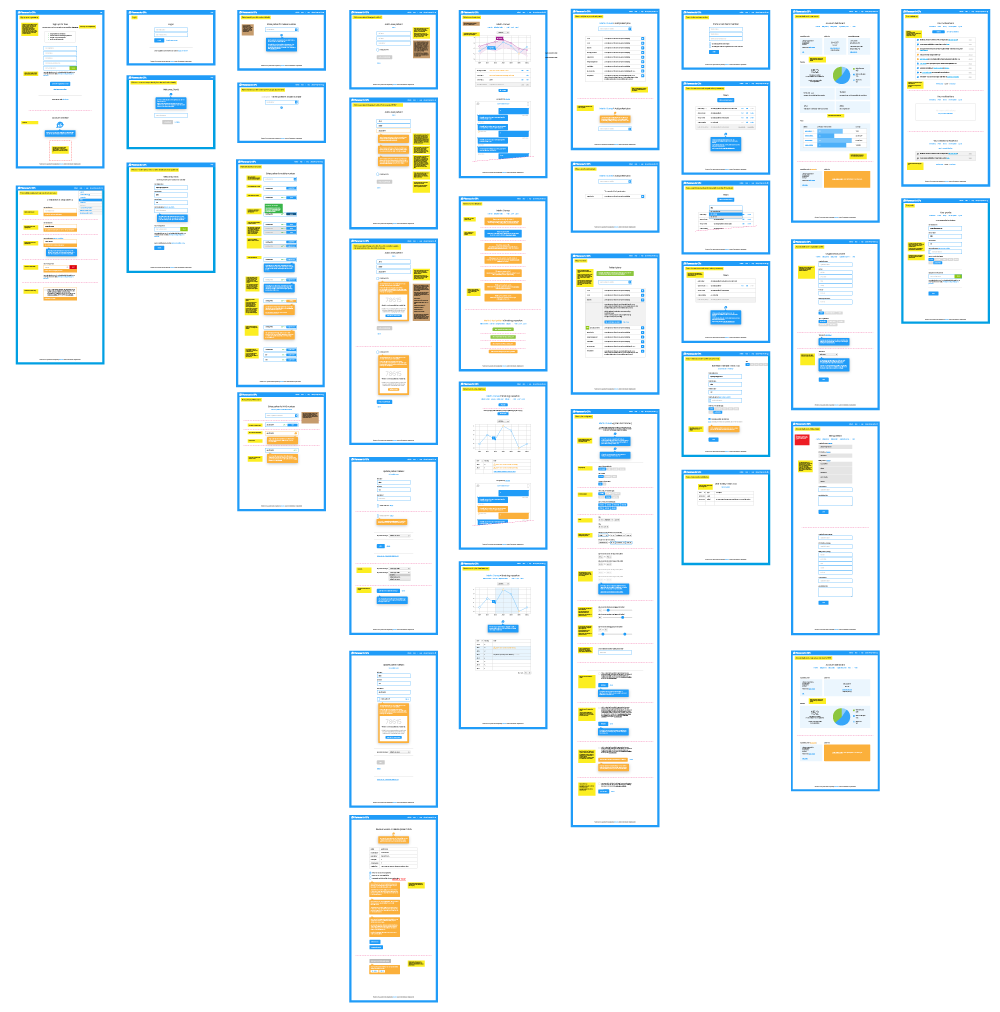
Patient search and add
Speed is critical to the app’s success. Clinicians need to complete their task during a ten-minute patient consultation as quickly as possible.
Very early on in the project, I set us the challenge of combining the workflows for adding patients, requesting access to their Florence Light record, and finding patients on the system – more than a dozen different states – into a single view.
In fact, into a single input:
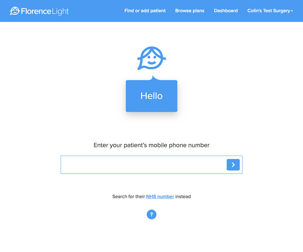
This box then works hard, reacting intelligently to the status of what’s entered by the user:
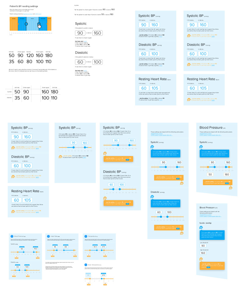
Plan settings – creating the slider
After adding a patient, the next step is to select a plan from the list and set some basic parameters.
In contrast to the original Florence app, the Florence Light plans are largely pre-configured. The app focuses on the most common conditions and support patterns, such as when a patient is newly diagnosed with Hypertension, or needing support with managing asthma. Even the frequency of messages and duration of plan are fixed (which also helps with setting pricing).
Where a clinician does need to have some control is on alerting limits.
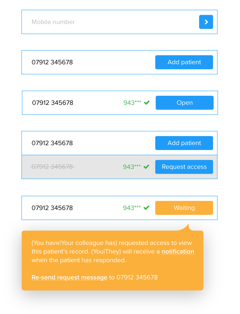
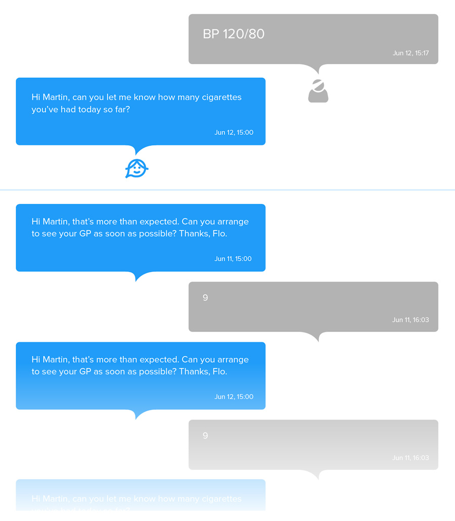
So, for example, if Flo texts the patient and asks them to send her a blood pressure reading, she needs to know how to respond depending on the levels of the reading.
Each patient will be different, so the level at which the blood pressure is so high (or low) that Flo needs to tell them to seek urgent assistance needs to be controllable by the clinician:
- Set upper and lower limits for a normal reading range (the mid-ground)
- Set upper and lower limits for a follow-up range where the patient ought to seek medical advice
- Set upper and lower limits for when the patient needs to seek urgent medical attention
- Set independent systolic and diastolic limits for blood pressure readings.
The challenge is enabling them to do that in an intuitive way:
- Make the UI a visual representation of the settings so it can be reviewed at a glance (so, not just input fields)
- Make a single UI pattern that can be used to set the majority of reading types (blood pressure, heart rate, blood glucose, blood oxygen saturation, temperature, weight etc)
- Make it accessible
- Set sensible, intelligent defaults so for the majority of cases no change, or only small changes are needed to be made by clinicians.
The solution was this:
- Can be set using a pointing device (including finger on touch)
- Can be set using a keyboard by selecting the label and typing
- Label can be tabbed-in-to for accessibility
- Underlying code based on JQuery UI slider, but with a lot of customisation.
It took quite a lot of prototyping, exploration and testing to get to it:
The patient experience
One of the brilliant things about the Florence concept is its accessibility for patients. Using widely available and ubiquitous text messaging means it can be used by a large proportion of patients.
And, because clinicians do the setting up, for patients the experience is a straightforward interaction.
But that doesn’t exclude the patient from their need or desire to be in control of their data. And, from a regulatory point of view, we need to give them that control.
So, the patient acts as a joint data controller. They are in control over what they receive, and who see it.
Joining
When they–re added to Florence Light, and are put on the first plan (as part of the same clinician workflow), Flo sends a text asking for their permission to join and start the selected plan. They respond yes. or no (or ignore it) and Flo obliges.
Getting access to an existing patient’s record
When a clinician of another organisation would like access to the patient’s Florence Light record so they can view results or add their own plans, they request access and the patient is asked if they want to give it.
Transferring numbers
If the patient has a mobile phone number that used to belong to someone else who already has a record on Florence Light with that number, they can be added as a new patient with a straightforward code-based workflow. The request is made, a code is sent, and entered, and the number is transferred. The other patient’s record still exists, and they can be found using their old number, but a clinician with access to their record will need to update their number so they can receive new messages. Sounds straightforward, but the intricacies and edge cases could cover a case study in their own right. Which is why it really helps working closely with a fellow thinker on these things.
STOP
And finally, if the patient wants to stop, they just reply to Flo with ‘STOP’. That’s it.
Summary
Feedback from beta testers has been positive. We ironed out a couple of small niggles and everything else were suggestions for improvements we already have on our roadmap and wish list.
The app is only recently completed, and the push to market will be happening soon, so there aren’t yet any figures to prove success.
However, what we are confident of is that we created something that truly matches the ambition of putting all the complexity out of sight to achieve a beautifully simple user experience.