As part of the process of creating the new Florence Light app, we needed a logo and website, and a brand style and tone of voice that would span the app and marketing communications.
The new brand had to match the aims of the app to be simple, straightforward and accessible. It also needed to be friendly, reflecting the nature of the patient-facing user experience of the app, with the ambition of that friendliness flowing through the whole brand.
Naming
The pre-existing Florence app (a mature app we also made, which Florence Light is designed to compliment) has a lot of positive brand equity, so it was logical to base the new brand on it. We were, however, mindful to make it clearly different to help uses differentiate between the two.
When it came to naming the new app, we looked at quite a few options (sorry, can’t tell you) before selecting ‘Florence Light’.
The ‘Light’ suffix, in direct comparison to the app’s grown-up sister, says: “This is more straightforward and quicker, with fewer options giving greater ease” – which is pretty close to the reality we were aiming for.
Logo
The logo is mainly typographic, and uses the brand font family, Proxima Nova, which was selected for its simplicity, readability and familiarity. The two words of ‘Florence Light’ are concatenated, but given different weights – the parent ‘Florence’ with the brand equity the heavier.
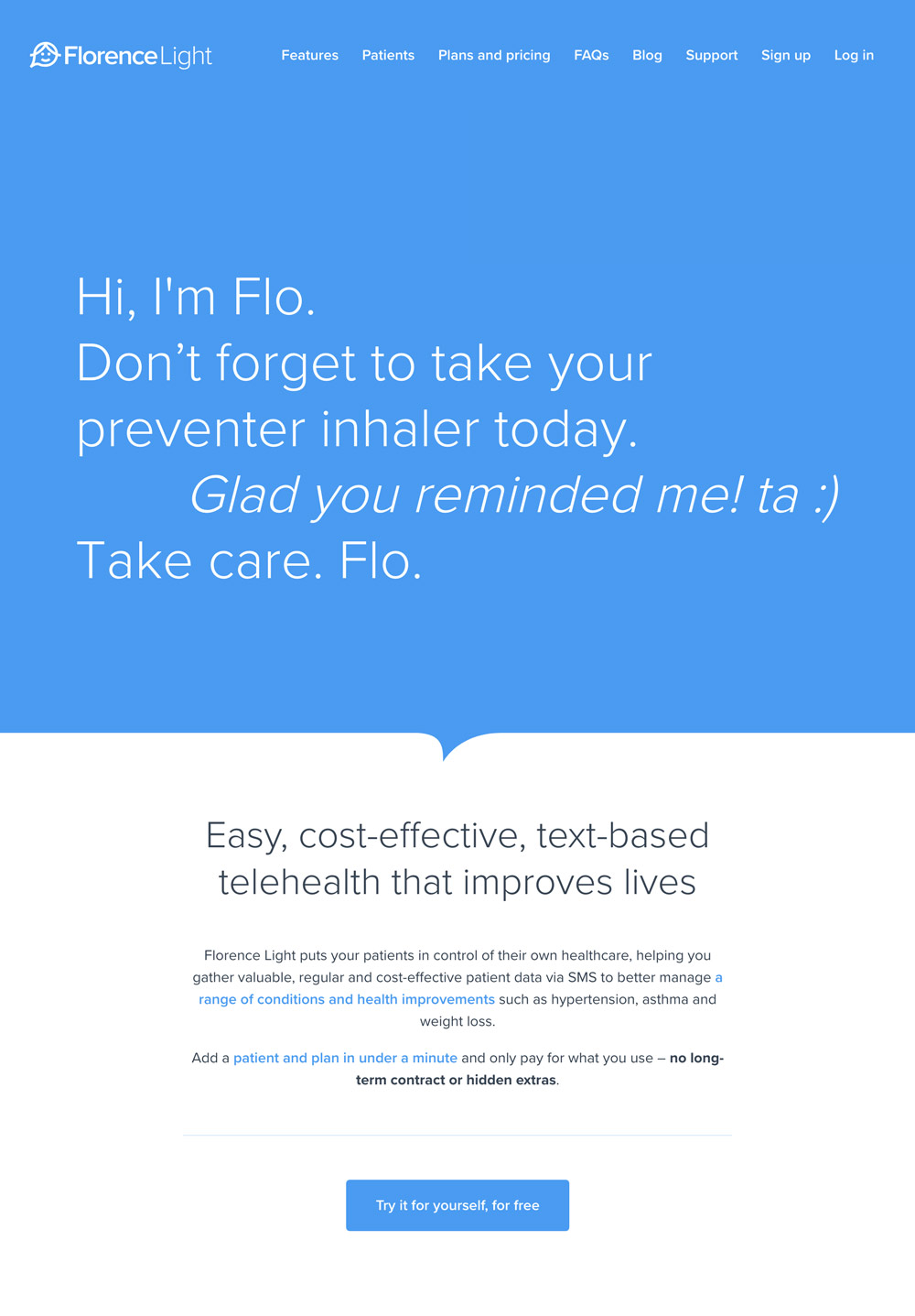
It also includes a simple graphic that represents Flo’s smiling face (which immediately makes it a cheery brand and establishes a persona) and a speech bubble that’s representative of a chat conversation.
Tone of voice and nomenclature
Tone of voice is important with any brand. One of the observations about the existing app is that tone of voice is inconsistent – the website and app differ, and the messages written by multiple clinicians and admins for patients to receive are inevitably varied.
For Florence Light we wanted to fix all that by giving the brand a believable persona that would flow through all touch points.
So, tone of voice was set: Flo was to be an experienced, friendly nurse – the kind you find on a busy hospital ward who still manages to listen and put patients at ease no matter how run off her feet she is.
We also wanted to make sure we were consistent on what we called things. So I drew up a ‘nomenclature’ list of more than a dozen common names/phrases we’d always use. Here are a couple:
Real patients (not ‘live patents’, ‘actual patients’, ‘true patients’, ‘authentic patients’, ‘existing patients’)
Mobile phone (not ‘handset’ or ‘smartphone’ or ‘dumb phone’ or ‘feature phone’ or ‘telephone’ or ‘mobile’ or ‘mobile telephone’ or ‘telephone’ or ‘phone’)
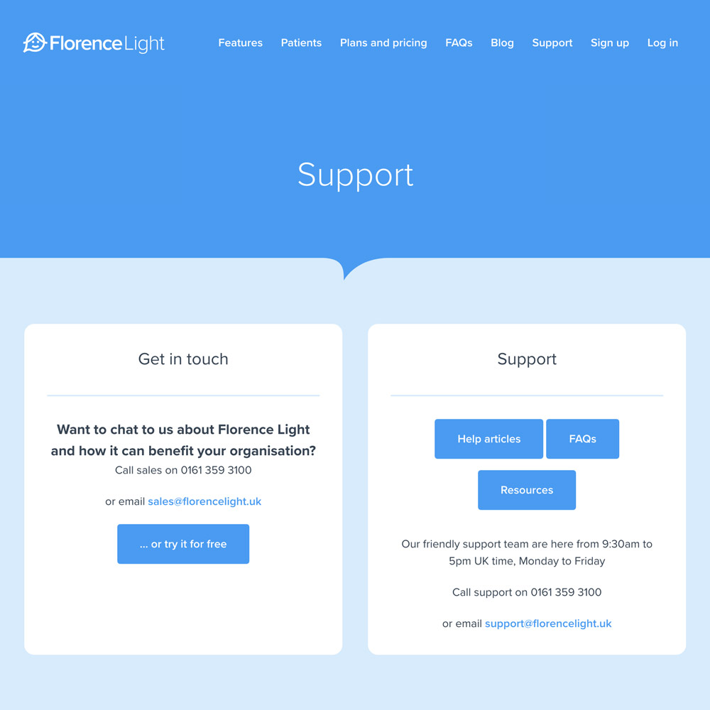
Website
The overall objective of the Florence Light website is to be the main lead generator for online sign ups.
There was a lot to say, but it had to be done in as simple a way as possible to compliment the app.
We needed to:
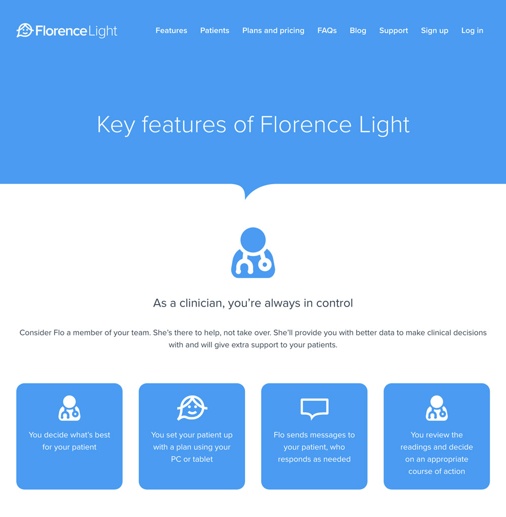
- Say what Florence Light is
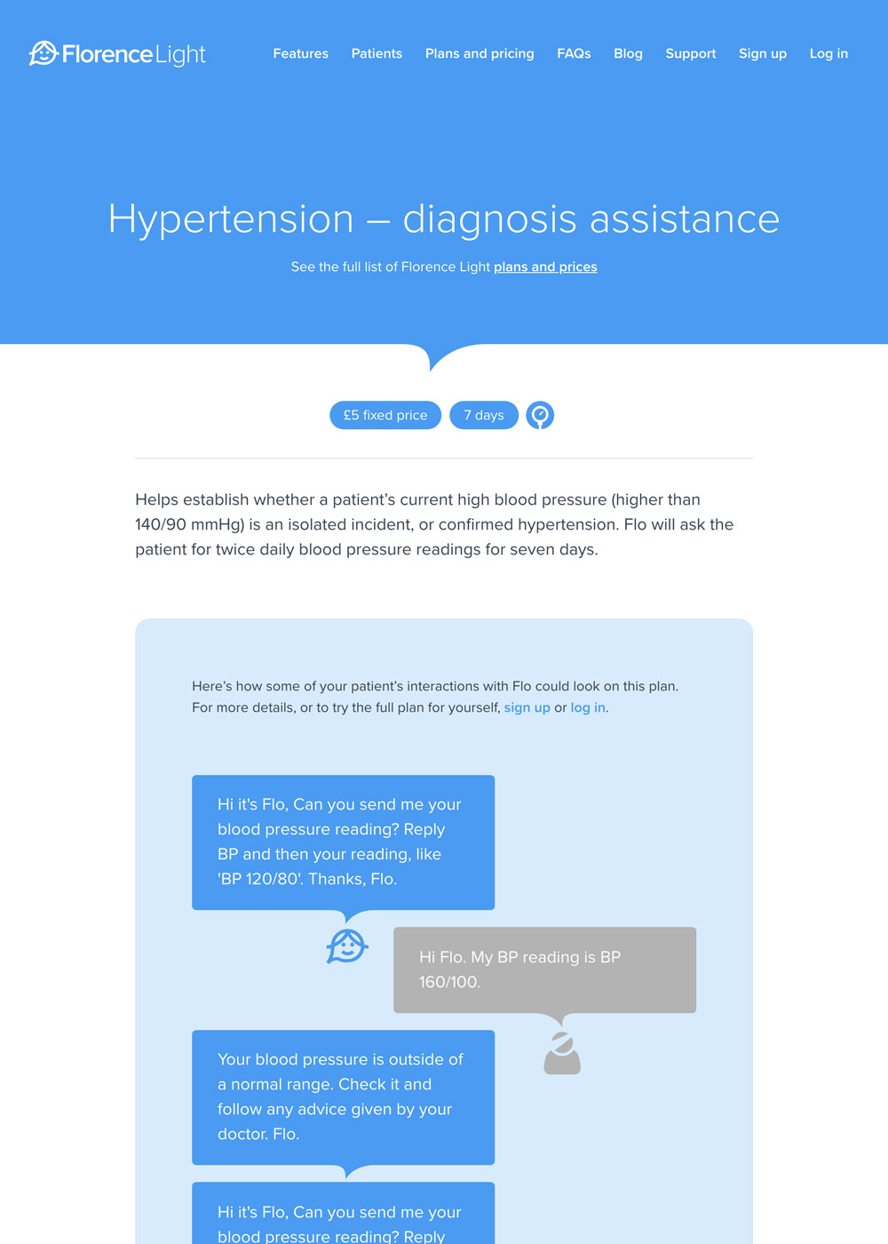
- Quickly demonstrate the concept so new users ‘get it’
- Show benefits for clinicians and patients
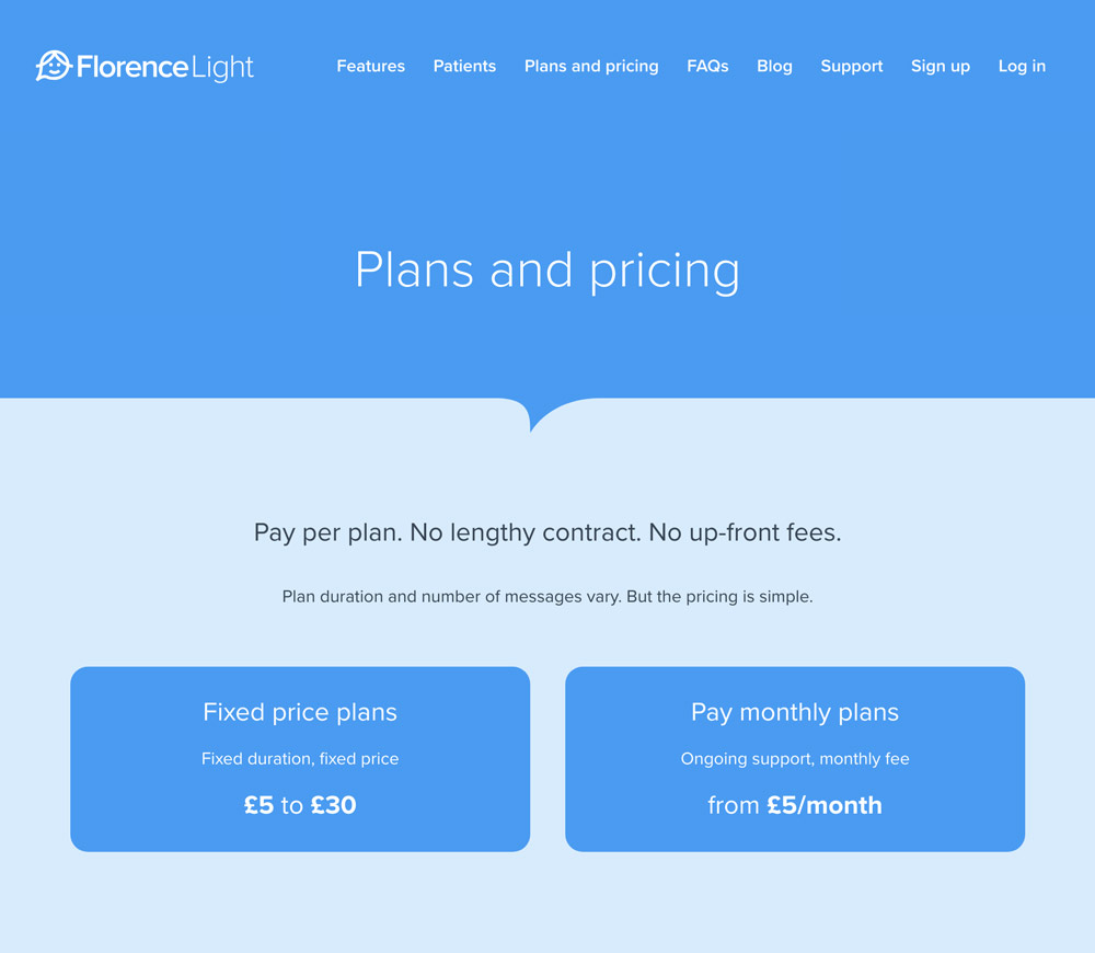
- List plans and their pricing
- Show FAQs
- Provide contact info
- Include sign up/log in links.
Content
An initial content plan was sketched out, capturing the key messages and user workflows. This allowed us to rationalise, group and order messages. It also helped form a brief for the copywriting, which I also did for the whole site, data sheets and marketing materials.
Design
The content plan, which was essentially a set of annotated thumbnails, was sketched up into a more detailed set of wireframes.
Those wireframes were valuable because they helped highlight repetitions and omissions in certain sections.
The finer detail of the design – including animations and parallax effects – was worked though as I built the site (with Jekyll and SASS).