Textburst was a fantastic app. With it, businesses could send one or many thousands of text messages to customers or contacts and receive replies. It had a great reputation, but was in danger of being left behind in a highly competitive marketplace.
The user interfaces and overall user experience needed an overhaul. There were inconsistencies, a lack of responsiveness and poor accessibility.
The aesthetic and technical improvements were relatively straightforward. For the rest, I mined customer feedback and analytics data to discover the main issues getting in customers’ way – many of which focussed around the sign up and onboarding process, which was having a measurable effect on company performance.
Consistency, predicability and unambiguity
The app had grown organically over many years and had been touched by a number of designer and developers. It was inevitable there would be some variations in copy, interactions and workflows throughout the app.
Inconsistency can make users feel uneasy. When two similar things have different names, it raises doubts about their similarity. Where button labels are ambiguous, it makes users hesitate.
But, when similar objects or interactions are given the same name and their purpose is clear and unambiguous, it’s easy for users to quickly understand and the patterns and form habits, making them feel at home with a sense of familiarity and predicability.
So, I set about fixing things.
Going through the app with a fine-toothed comb, enhancements included:
- Giving pages the same name wherever they were referenced in the app
- Save, OK, Cancel buttons were all labelled consistently and appropriately
- OK and Cancel buttons on confirmation modals were put in the same order on every instance
- Making input labels such as ‘last name’ vs ‘surname’ consistent.
Issues mining
There were plenty of obvious improvements that could be made to the app. But it wasn’t enough to cherry-pick the obvious.
Fortunately, the customer services team had been using a great CRM for some time and there was a wealth of information hidden within.
I set about filtering thousands of past tickets, looking for Textburst-related issues, counting and categorising what I found. What I ended up with was a list of key problems users were having with the app.
The list included lots of minor issues and confusions, some of which had been solved by removing inconsistencies. Others were feature requests. Others were things that could be fixed with some careful attention to design.
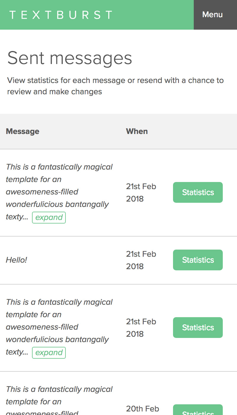
Responsiveness and mobile accessibility
The Textburst web app had never been mobile optimised. It had a fixed-width frame based loosely on a Bootstrap grid and theme.
It wasn’t just about making the app mobile optimised – even on desktop (which is always likely to dominate for our users), the app wasn’t taking proper advantage of the space available.
The remnants of the old Bootstrap theme were stripped out and the style rules tidied and split into manageable chunks, reducing the css by nearly a half.
Improvements to the brand implementation, main navigation and footer all contributed to making the app much better looking and more befitting of a modern app UI.
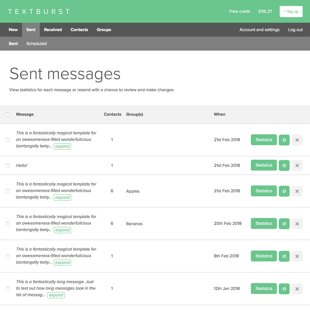
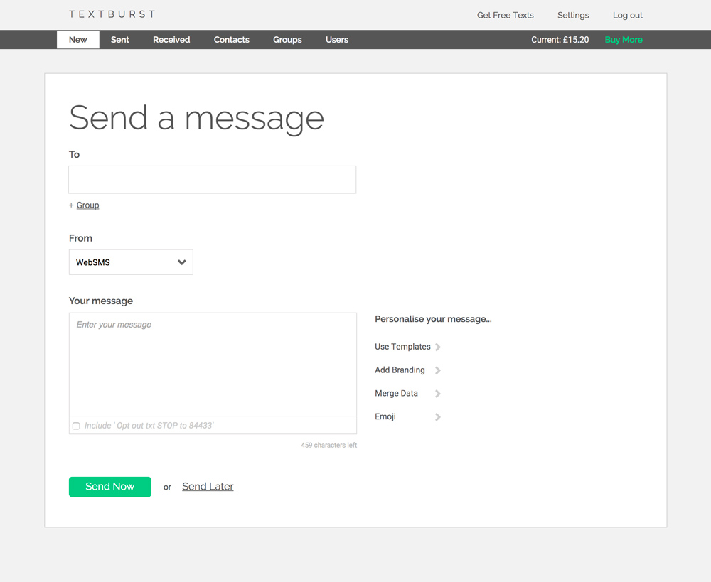
Send message page
The main page of the app – the send page – is where the magic happens.
Feedback from users, which was evidenced in the tickets, showed particular issues with:
- the message character counter not being clear
- the number of concatenated sms in a message not being clear (long messages span multiple actual SMS)
- the total number of SMS for the send not being clear
- the templates and emoji menus being hard to access unless the browser window is large.
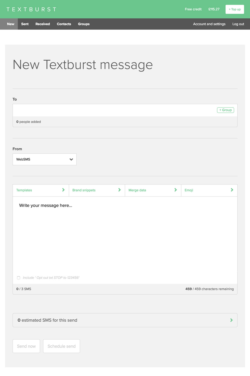
The new send page UI gives a better user experience in many areas:
- is now responsive, thanks to the improved underlying structure and css
- the ‘To’ box now counts the number of people added, dealing with duplicates in groups, blacklisted and invalid numbers
- templates, brand snippets, merge data and emoji menus are now in a toolbar above the message textarea
- more space is given to the star of the show – the message – which is also now full width and in a bigger font size
- the character counter is more prominent within the message editor UI and shows the number of characters remaining out of the total available
- a new SMS counter clearly shows the number of SMS the composed message will take
- a new summary box shows simply how many SMS are in the send (number of SMS per message multiplied by the number of people – both of which can be seen progressively revealed by clicking the down arrow.)
- improved schedule send UI with improved calendar and time inputs, tidier grouping of UI elements and better microcopy on button labels and actions so users have to think less.
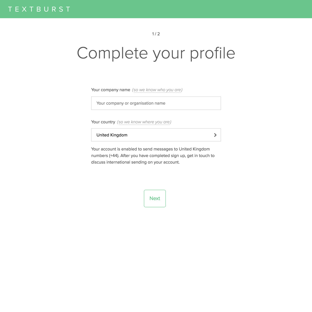
GDPR compliance
The list of micro-copy changes and UI detailing is long. But we’ve made some other major feature changes. Most recently (May 2018) we released an update across all our apps to help us with GDPR compliance (read about the GDPR project in detail).
Changes to the Textburst UI were done carefully, with as little intrusion into the user experience as possible.
The main updates were:
- Addition of a terms and conditions acceptance checkbox to the sign up form
- Improved copy on the sign up confirmation email
- New two step onboarding workflow to capture additional account information and marketing email opt-ins
- New communication preferences page (which was actually an expansion of an existing preferences page).